


Contents
- What is a Style Guide and Why Does it Matter?
- How to Build a Style Guide
- What Should be Included in a Style Guide?
- Utilizing Figma To Jump Start Your Style Guide
A well-constructed style guide is a crucial element in software development. It serves as a communication tool between UX designers and developers, ensuring that the final product aligns with the design vision while streamlining the development process. Additionally, a style guide establishes a cohesive user experience, increasing user satisfaction and retention. In this blog post, we'll explore the importance of creating a comprehensive style guide, step-by-step instructions on how to build one, the key elements that should be included, and some of our favorite tools to help you create an elegant and effective style guide for your software development project.
What is a Style Guide and Why Does it Matter?
A style guide is a critical reference document that provides guidance on the visual and aesthetic elements of a software development project. It outlines typography, color palette, iconography, and UI components that are used to create high-fidelity designs, ensuring consistency and coherence throughout the project.
Style guides can take various forms and serve as a go-to resource for designers, developers, product managers, and stakeholders involved in the project. Clarity and simplicity are essential to ensure that everyone can access and use the style guide effectively.
Here are some tactical ways in which teams can use style guides:
- Instructing designers on how to design the interface consistently
- Informing marketing teams of a product's branding and themes
- Communicating to the development team how to build components on multiple breakpoints
- Helping product managers and stakeholders understand how the product is built to inform roadmaps.
By having a comprehensive style guide, teams can streamline their efforts and ensure that the final product meets the design vision and user needs.
Related Content: Design Systems 101
How to Build a Style Guide
Style guides can come in many different lengths and formats, but at its core, it should include what’s necessary for the development team to translate a design into code, and be easy enough to navigate so stakeholders can find what they need. This usually includes, but is not limited to typography, color palette, iconography, and UI components. Below is a step-by-step list to set your style guide up for success.
Step 1: Understand the product’s framework
To build an effective style guide, it's essential to understand the product's framework and the technology stack the product is being built with. This will inform what coding language and framework the development team will use, as well as the libraries that the design team will create. Additionally, the typography, iconography, and color palette used in the design will depend on the product's intended use on web, mobile, VR, wearables, or other platforms.
Understanding technology is necessary to establish a strong foundation for UX/UI design. Before beginning anything, take the time to research and learn about the product's tech stack so that you'll know the constraints and limitations you'll need to work with, which can help you create a style guide that's both effective and feasible.
Tip to remember: Understanding your tech stack is essential in building a successful style guide that meets both the design vision and technical requirements of the product.
Step 2: Choose your tools
Choosing the right tools is crucial when building a style guide. Each development team has its preferences and comfort level with the level of detail they want in a style guide. It's essential to determine how comfortable the front-end team is with design software and whether they need a short tutorial to understand the tools you're using.
Design tools like Figma have streamlined communication between designers and developers through their language and interfaces, making them an excellent choice for creating style guides. Browser-based tools are also a great option as they allow for easy sharing and collaboration among team members who are less tech-savvy. Additionally, plugin support is an important consideration that depends on the nature of your project.
Before choosing your tools, ensure that you've worked through Step 1 and understand the project's implications and the team's skillsets. By adapting to the project's unique requirements, you can select the right tools that suit your team's needs and build a style guide that's both effective and efficient.
Step 3: Define handoff requirements
Defining handoff requirements is a critical step in building a style guide. Style guides can range from one page to over ten pages, with typography, color palette, and iconography being core foundations. However, the length of the document is primarily dictated by the components' definition needed, which can vary between things like breakpoints, hover states, and copy changes. For example, the layout of how typography is presented is usually very consistent, ranging from H1 all the way to helper text in forms. However, components can change between things like breakpoints, hover states, copy changes, and the list goes on. For this reason, it’s also important to ask the dev team how much definition is needed between states and behavior. Documentation can vary for different design libraries chosen, so it’s up to the UX/UI designer to fill in the necessary gaps.
When exporting your style guide, it's important to consider your team's unique requirements. Some teams use an intermediary program like FullStory or Zeplin to house their dev components, while others prefer to click directly into a Figma file to inspect everything themselves. Alternatively, some teams may prefer a PDF or a one-pager for easy sharing.
Remember, documentation can vary depending on the design libraries chosen, so be sure to tailor your style guide to the unique needs of your team. By defining clear handoff requirements, you can ensure that everyone has the information they need to build an effective and consistent product.
What Should be Included in a Style Guide?
A style guide serves as a reference document for design teams to ensure consistency and cohesiveness in the visual language of a project. In this section, we will explore the essential elements that make up a style guide, including typography, color palette, iconography, and component library. By including these core foundations, teams can streamline their workflow and create a more efficient design process.
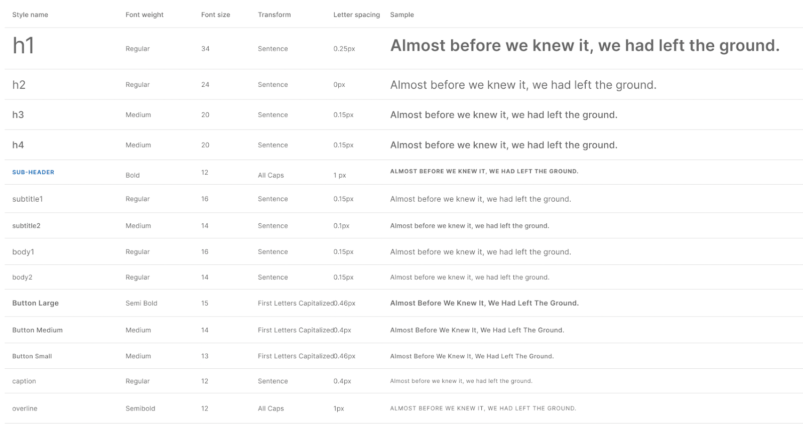
Typography
Your typography section should include the fonts and main text styles in hierarchical order. If you are using a custom font that isn’t available for a free download, it would be helpful to call that out here. Most style guides include H1’s all the way through body text. Be sure to include any buttons, links, and form input text as well. Some standard specs to include are:
- Font family
- Hierarchy (H1, H2, etc…)
- Size
- Weight
- Transform
- Color, if necessary
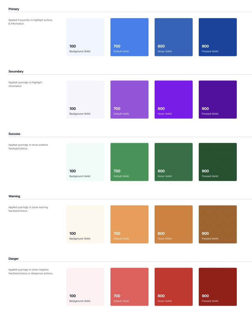
Color Palette
Your colors should include the primary, secondary, and tertiary palettes used throughout the product. These are typically laid out in clean, simple shapes with the name and hex code assigned to each. This will be used for devs to build out the stylesheet/CSS in the code. Be sure to test that your colors contrast and are ADA-compliant, and follow best practices with the framework your product is being built in. For example, be aware of out-of-the-box success and failure state colors for components that may not need changed unless there is a specific reason to do so.
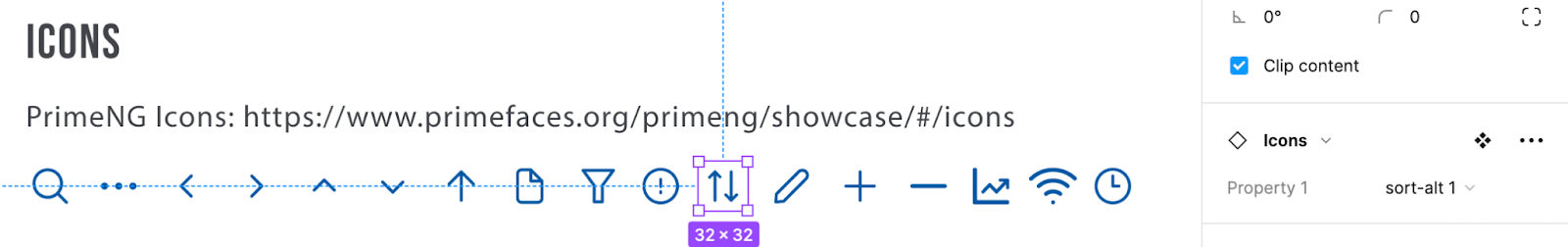
Iconography
Which icon library you use is a direct result of understanding the tech framework. Building an iOs app will point to a natural selection of Apple’s system icons, or a library such as Ionic. Will you need outlined, filled, or both icon sets? Knowing your systems standard UI and product branding will allow you to select the most cohesive icon library. Be sure to include any custom icons that are downloaded from a third party, or you create yourself. Most major icon libraries have a downloadable file or plugin you can import to your design software, but it’s important to verify you have the correct naming conventions documented for dev so they can plug it into their code easily.
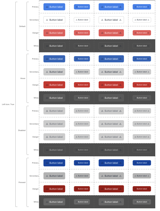
Component Library
While all of the other pieces listed above could, in theory, fit on one page, the components usually require more documentation. Some examples of component libraries include: Material UI, Ant Design, and React Bootstrap. After you specify which library is being used, you can devote as much real estate as needed to show developers the following effectively:
- The name, states, and variants of a component
- The link to the library’s documentation about the component
- Any breakpoints altering the appearance of the component
- Any specs detailing the CSS (optional)
Utilizing Figma To Jump Start Your Style Guide
Figma is a powerful design tool that can significantly streamline the process of creating a style guide. With its versatile features and extensive plugin resources, designers can save time and improve their workflow by utilizing plugins specifically tailored for creating style guides. Take a look at these three Figma plugins our UX/UI designers love to use:
Related Content: Using Figma For Design Collaboration
Closing
Building a style guide is just the beginning of creating a successful product. It's essential to build in a scalable way to ensure the product can grow with the team and meet future needs. One way to achieve scalability is by using features like auto layout and components/variants in Figma. These features allow for the creation of dynamic, reusable elements that can save time and increase efficiency. By implementing these practices, teams can streamline their design process and focus on creating new, innovative features instead of constantly re-creating existing ones.
In conclusion, a strong style guide lays the foundation for a successful product, but scalability is key to sustaining its growth. To learn more about creating scalable designs and accelerating your product design process, schedule a call with our experienced UX designers today.


